CSS
2022-2-12 大约 7 分钟
# CSS
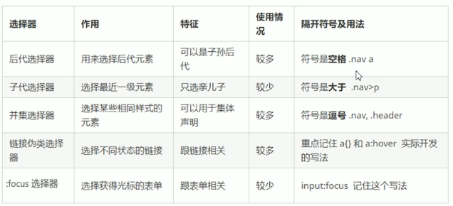
# 基础选择器
/*标签*/
p {

}

/*- 类选择器*/
.name {

}

/*- id选择器*/
#myname {

}

/*- 通配符选择器*/
* {

}
1
2
3
4
5
6
7
8
9
10
11
12
13
14
15
16
17
18
19
2
3
4
5
6
7
8
9
10
11
12
13
14
15
16
17
18
19
# 复合选择器
# 块元素
- 常见:p h1 div li ol ul
- 独占一行,
- 高,宽,外边距,内边距可以设置
- 宽度默认为父元素的100%
- 除文字类元素外,里面可以发行内元素或块级元素,
# 行内元素
- 常见:span a 也叫内联元素
- 一行显示多个
- 宽高无法设置,默认宽度为内容宽度
- 只能容纳文本或其他行内元素,a标签不能再放a标签,但能放块级元素
# 行内块元素
- 常见:img input td 同时具有行内元素和块元素的特点
- 可以再一行内显示,但是会有间隙
- 默认宽度为内容的宽度
- 可以设置高,宽,外边距,内边距
# 行内和块级和行内块元素互相转化
- display:block
- display:inline
- display:inline-block
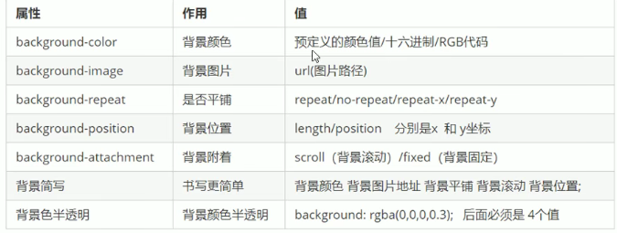
# 背景属性
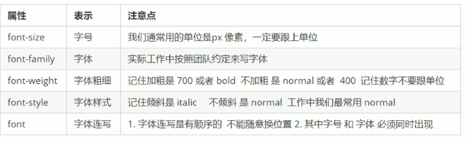
# 字体属性
# 文本属性
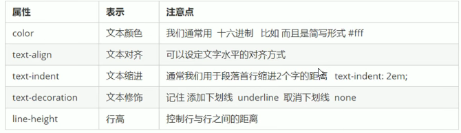
- 设置行高为盒子宽度可以实现垂直居中
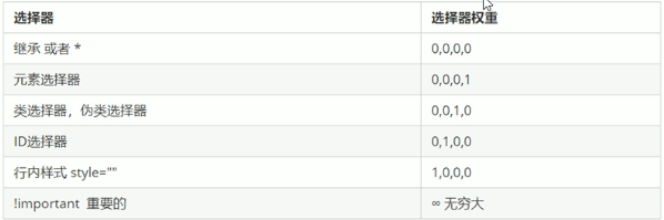
# css三大特性:层叠,继承,优先级
- 继承权重为0
- 权重可叠加
# 盒子模型
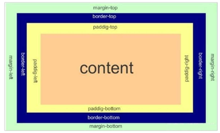
- 若盒子的height和width确定了大小,再border和padding会增大盒子。可通过box-sizing 设为border-box解决
- 圆角边框:border-radius:10px
- 盒子阴影:box-shadow:h-shadow v-shadow blur color insert
- 文字阴影:text-shadow:h-shadow v-shadow blur color
- 外边距合并父元素塌陷问题:
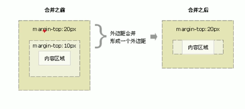
解决:
- 为父元素定义边框border或内边距padding
- 给父元素添加overflow:hidden盒子不会增大
# 浮动
特点:脱离标准流,但不盖住文字和图片元素具有行内元素的特点 额外标签法清除浮动
# 定位
相对定位不脱标 绝对定位,固定定位:
- 脱离标准流且会压住下面标准流所有的内容
- 具有行内元素的特点
# 常用技巧
- 可在元素设置width属性时设置margin:auto来水平居中
- 行内或者行内快元素实现水平居中:父元素text-align:center
- 图片底测空白间隙问题:
- 原因:行内块元素会和文字的基线对齐
- 解决:
- vertical-align: middle
- 将图片转成块元素让vertical-align属性失效
- 文本溢出显示省略号
div {
    /* 1.这个单词的意思是如果文字显示不开也必须强制一行内显示 */
    white-space: nowrap;
    /* 2.溢出的部分隐藏起来 */
    overflow: hidden;
    /* 3. 文字溢出的时候用省略号来显示 */
    text-overflow: ellipsis;
}
1
2
3
4
5
6
7
8
2
3
4
5
6
7
8
# CSS3新增
# 属性选择器
类选择器和属性选择器 伪类选择器 权重都是 10
input[value] {
    color:pink;
}
input[type=text] {
    color: pink;
}
div[class^=icon] {
    color: red;
}
section[class$=data] {
    color: blue;
}
1
2
3
4
5
6
7
8
9
10
11
12
2
3
4
5
6
7
8
9
10
11
12
# 结构伪类选择器
/* child */
ul li:first-child {
    background-color: pink;
}

ul li:last-child {
    background-color: pink;
}

 ul li:nth-child(2) {
    background-color: skyblue;
}
ul li:nth-child(6) {
    background-color: skyblue;
}

/* of-type */
ul li:first-of-type {
    background-color: pink;
}
ul li:last-of-type {
    background-color: pink;
}
ul li:nth-of-type(even) {
    background-color: skyblue;
}

/* 两者区别 */
/* nth-child 会把所有的盒子都排列序号 */
/* 执行的时候首先看  :nth-child(1) 之后回去看 前面 div */
section div:nth-child(1) {
    background-color: red;
}
/* nth-of-type 会把指定元素的盒子排列序号 */
/* 执行的时候首先看  div指定的元素  之后回去看 :nth-of-type(1) 第几个孩子 */
section div:nth-of-type(1) {
    background-color: blue;
}
1
2
3
4
5
6
7
8
9
10
11
12
13
14
15
16
17
18
19
20
21
22
23
24
25
26
27
28
29
30
31
32
33
34
35
36
37
38
2
3
4
5
6
7
8
9
10
11
12
13
14
15
16
17
18
19
20
21
22
23
24
25
26
27
28
29
30
31
32
33
34
35
36
37
38
# 伪元素选择器
::before和::after新建一个行内元素,这个元素在文档树中是找不到的
div::before {
    content: '我';
}
div::after {
    content: '小猪佩奇';
}
1
2
3
4
5
6
2
3
4
5
6
# 过度效果
div {
    width: 200px;
    height: 100px;
    background-color: pink;
    /* transition: 变化的属性 花费时间 运动曲线 何时开始; */
    transition: all 0.5s;
}
div:hover {
    width: 400px;
    height: 200px;
    background-color: skyblue;
}
1
2
3
4
5
6
7
8
9
10
11
12
2
3
4
5
6
7
8
9
10
11
12
# transform 转换
- 移位translate
div {
    width: 200px;
    height: 200px;
    background-color: pink;
    /* x就是x轴上移动位置 y 就是y轴上移动位置 中间用逗号分隔,x,y可以是百分比,参照盒子自身的宽度或者高*/
    /* transform: translate(x, y); */
    /* transform: translateX(100px); */
    /* transform: translateY(100px); */
}
1
2
3
4
5
6
7
8
9
2
3
4
5
6
7
8
9
- 旋转rotate
img {
    width: 150px;
    /* 顺时针旋转45度 */
    /* transform: rotate(45deg); */
    border-radius: 50%;
    border: 5px solid pink;
    /* 过渡写到本身上,谁做动画给谁加 */
    transition: all 0.3s;

    transform-origin: 50% 50%;
}

img:hover {
    transform: rotate(360deg);
}
1
2
3
4
5
6
7
8
9
10
11
12
13
14
15
2
3
4
5
6
7
8
9
10
11
12
13
14
15
- 缩放scale 不会影响其他的盒子 而且可以设置缩放的中心点
div:hover {
    transform: scale(2);
}
1
2
3
2
3
- 3d移动
body {
    /* 透视写到被观察元素的父盒子上面 */
    perspective: 200px;
}

div {
    width: 200px;
    height: 200px;
    background-color: pink;
    /* transform: translateX(100px); */
    transform: translate3d(400px, 100px, 100px);
}
1
2
3
4
5
6
7
8
9
10
11
12
2
3
4
5
6
7
8
9
10
11
12
- 3d旋转
body {
    perspective: 500px;
    /* 让子元素保持3d立体空间环境 */
    transform-style: preserve-3d;
}

img {
    display: block;
    margin: 100px auto;
    transition: all 1s;
}

img:hover {
    /* transform: rotateZ(180deg); */
    transform: rotate3d(1, 1, 0, 45deg);
}
1
2
3
4
5
6
7
8
9
10
11
12
13
14
15
16
2
3
4
5
6
7
8
9
10
11
12
13
14
15
16
# 动画
@keyframes move {
    0% {
        transform: translate(0, 0);
    }
    100% {
        transform: translate(1000px, 0);
    }
}

div {
    width: 100px;
    height: 100px;
    /* animation: name duration timing-function delay iteration-count direction fill-mode; */
    /* animation: move 2s linear 0s 1 alternate forwards; */
    /* 前面2个属性 name  duration 一定要写 */
     animation: move 2s linear  alternate forwards;
}

div:hover {
    /* 鼠标经过div 让这个div 停止动画,鼠标离开就继续动画 */
    animation-play-state: paused;
}
1
2
3
4
5
6
7
8
9
10
11
12
13
14
15
16
17
18
19
20
21
22
2
3
4
5
6
7
8
9
10
11
12
13
14
15
16
17
18
19
20
21
22
# less
// 定义一个变量
@fontSize: 14px;
div {
    font-size: @fontSize;
}
// 嵌套
.header {
  width: 200px;
  height: 200px;
  a {
    color: red;
    // 如果有伪类、交集选择器(h.test)、 伪元素选择器 我们内层选择器的前面需要加&
    &:hover {
      color: blue;
    }
  }
}
// 运算
// 1. 运算符的左右两侧必须敲一个空格隔开
// 2. 两个数参与运算  如果只有一个数有单位,则最后的结果就以这个单位为准
// 3. 两个数参与运算,如果2个数都有单位,而且不一样的单位 最后的结果以第一个单位为准
@baseFont: 50px;
img {
  width: 82rem / @baseFont;
  height: 82rem / @baseFont;
}
1
2
3
4
5
6
7
8
9
10
11
12
13
14
15
16
17
18
19
20
21
22
23
24
25
26
2
3
4
5
6
7
8
9
10
11
12
13
14
15
16
17
18
19
20
21
22
23
24
25
26
# 移动端布局
- 视口:浏览器显示的屏幕区域
- 布局视口:980px,手机屏幕太小,将980px压缩到手机屏幕大小后导致文字过小
- 视觉视口:用户可以看到的手机屏幕。
- 理想视口:通过meta标签将布局视口改到手机屏幕大小,即不同的手机视口布局视口大小不同,
<meta name="viewport" content="width=device-width, initial-scale=1.0,maximum-scale=1.0, minimum-scale=1.0, user-scalable=no">
1
# 流式布局
将盒子的大小设置成屏幕的百分比来布局
# 弹性布局(推荐)
- 容器属性:flex-direction,justify-content,flex-wrap,align-items,align-content
- 项目属性:flex,align-self,order
# rem布局 && vw,vh布局
- em:相对于父元素的文字大小
- rem:相对于rooty元素html字体的大小
- 媒体查询:针对不同屏幕设置不同样式
- vw:viewport width
- vh: viewport height
@media screen and (max-width: 800px) {
    body {
        background-color: pink;
    }
}

@media screen and (max-width: 500px) {
    body {
        background-color: purple;
    }
}
1
2
3
4
5
6
7
8
9
10
11
2
3
4
5
6
7
8
9
10
11
# 响应式布局
针对不同屏幕,用媒体查询设置不同样式
.container {
    height: 150px;
    background-color: pink;
    margin: 0 auto;
}
/* 1. 超小屏幕下  小于 768  布局容器的宽度为 100% */
@media screen and (max-width: 767px) {
    .container {
        width: 100%;
    }
}
/* 2. 小屏幕下  大于等于768  布局容器改为 750px */
@media screen and (min-width: 768px) {
    .container {
        width: 750px;
    }
}
/* 3. 中等屏幕下 大于等于 992px   布局容器修改为 970px */
@media screen and (min-width: 992px) {
    .container {
        width: 970px;
    }
}
/* 4. 大屏幕下 大于等于1200 布局容器修改为 1170 */
@media screen and (min-width: 1200px) {
    .container {
        width: 1170px;
    }
}
1
2
3
4
5
6
7
8
9
10
11
12
13
14
15
16
17
18
19
20
21
22
23
24
25
26
27
28
29
2
3
4
5
6
7
8
9
10
11
12
13
14
15
16
17
18
19
20
21
22
23
24
25
26
27
28
29
# bootstrap (opens new window)
- 栅格系统:将屏幕分成12份,设置不同屏幕下元素所占份数
<div class="container">
    <div class="row">
        <div class="col-lg-3 col-md-4 col-sm-6 col-xs-12">1</div>
        <div class="col-lg-3 col-md-4 col-sm-6 col-xs-12">2</div>
        <div class="col-lg-3 col-md-4 col-sm-6 col-xs-12">3</div>
        <div class="col-lg-3 col-md-4 col-sm-6 col-xs-12">
            <!-- 我们列嵌套最好加1个行 row 这样可以取消父元素的padding值 而且高度自动和父级一样高 -->
            <div class="row">
                <div class="col-md-4">a</div>
                <div class="col-md-4 col-md-offset-4">b</div>
            </div>
        </div>
        <div class="row">
            <!--  列排序          -->
            <div class="col-md-4 col-md-push-8">左侧</div>
            <div class="col-md-8 col-md-pull-4">右侧</div>
        </div>
        <!--   特定屏幕下隐藏   -->
        <div class="col-xs-3 hidden-md hidden-xs">我会变魔术哦</div>
    </div>
</div>
1
2
3
4
5
6
7
8
9
10
11
12
13
14
15
16
17
18
19
20
21
2
3
4
5
6
7
8
9
10
11
12
13
14
15
16
17
18
19
20
21